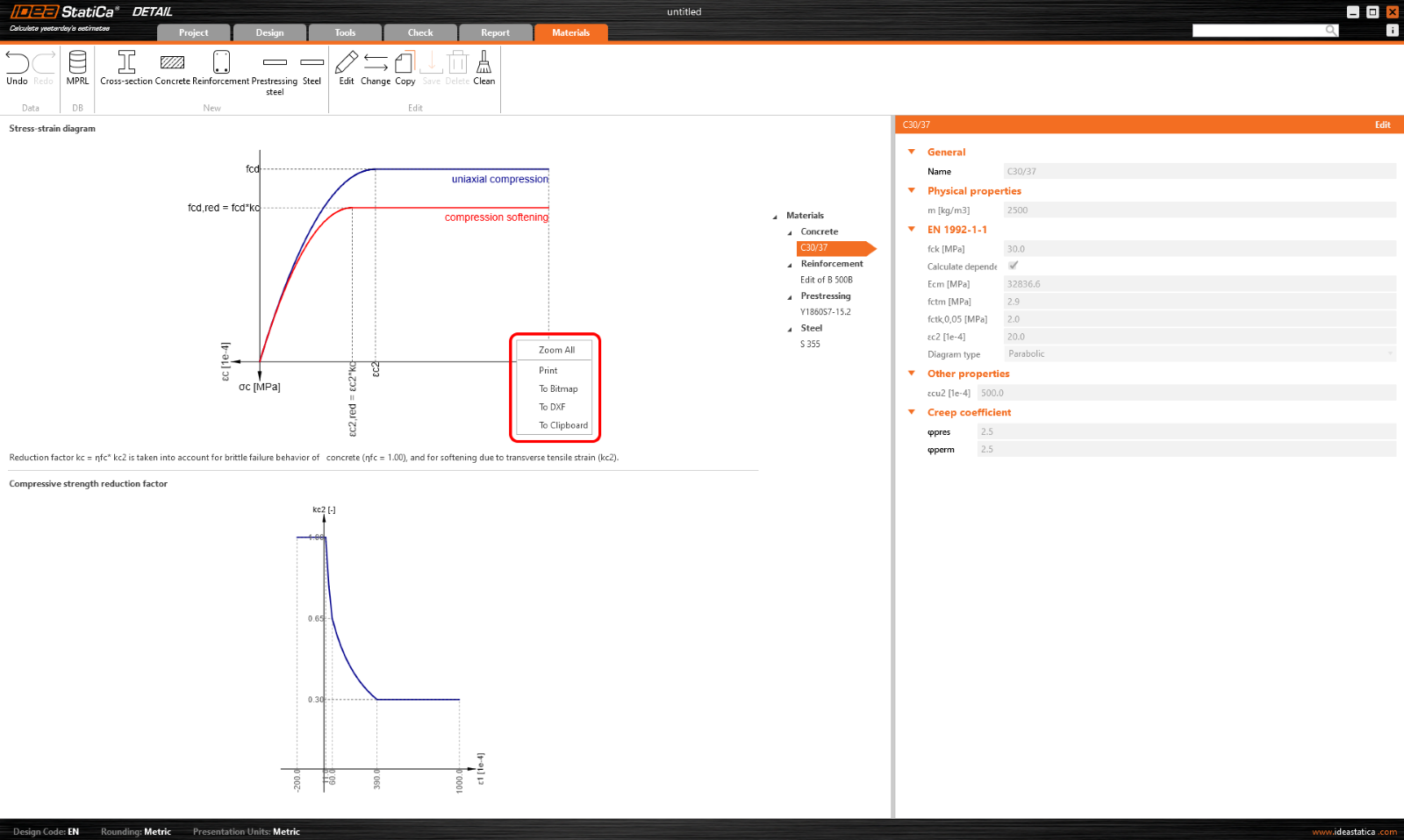
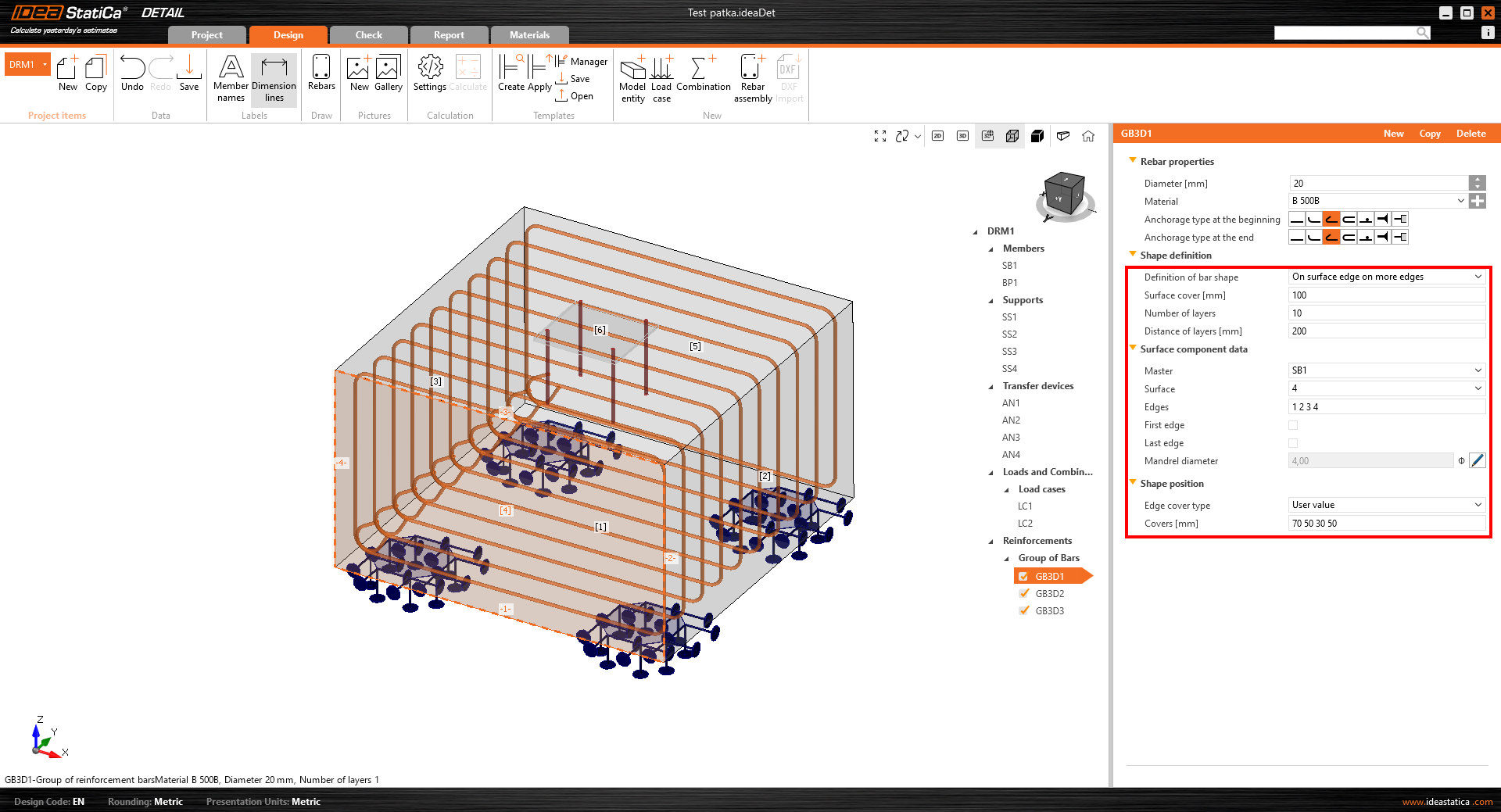
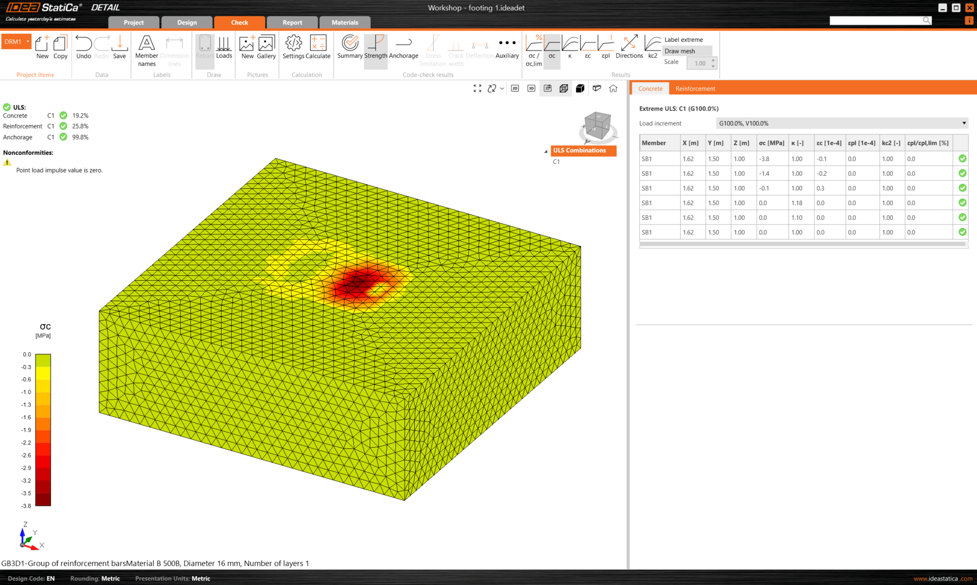
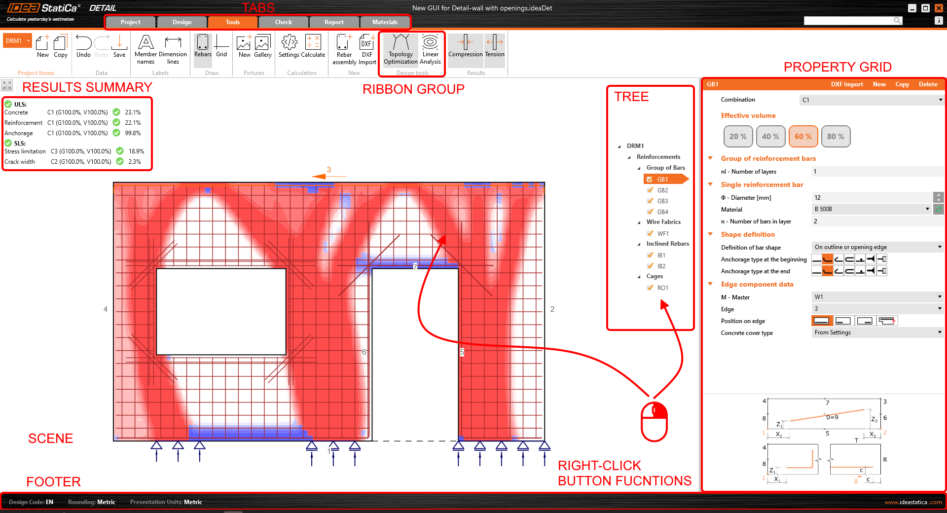
User interface: A unified design aesthetic
Ever experienced a slightly jarring switch between the different apps in our platform? You can say goodbye to that! In our latest version, we’ve aligned the UI of IDEA StatiCa Detail with its steel-structured older sibling, the Connection application. This change isn't just cosmetic, it's about creating a seamless, intuitive interface that feels familiar across our platforms. Introduced in version 23.1 and perfected in 24.0, navigating between applications is now a breeze, enhancing both your efficiency and comfort.
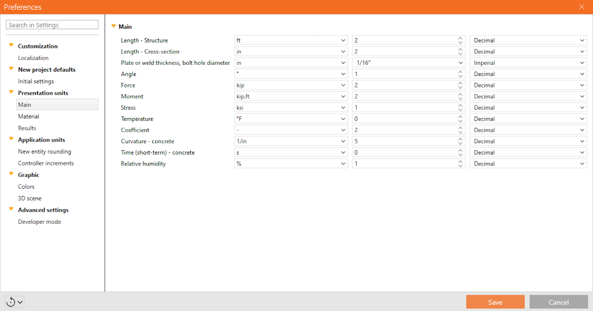
Shared preferences across apps
Consistency is key, which is why any change you make in the preferences of one application now ripples across to all others in our app suite. This unified philosophy ensures a smoother, more predictable design process, and you no longer have to waste time adjusting settings in each application separately. It should always be about making life easier, right?
Spring clean-up: Code and architecture optimization
We’re all about laying strong foundations here—not just in the structures you design, but in our software too. The architectural overhaul of IDEA StatiCa Detail’s code was ready for a serious spring clean—out with any old bugs and in with streamlined, sturdy coding practices. This significant clean-up means fewer headaches and disruptions when implementing new features. Our developers have dedicated many precious hours to making the code more and went back to the roots to prepare it for all and any . Crucially, the clean-up has significantly , freeing up valuable time for you to do whatever you like to do instead!